This page hosts several visualizations of near real-time COVID-19 confirmed data, using several different metrics and plot types. Automated updates
are posted every few hours, and final daily numbers are valid at 9:00 PM EST (0100 UTC).
Disclaimer: I am not a health expert. I am an Atmospheric Science Ph.D. student who takes interest in data analysis and visualization, and created this page to visualize publicly accessible COVID-19 data to help make the data easily accessible. Credit goes to the sources listed in the "Data Sources" section for making the data publicly available, and for Eric Weglarz for assisting with retrieving data.
March 27, 2022: All data is downloading normally again. US state maps for cases & deaths per capita are updating again after a bug fix.
This page uses data from Worldometers, Johns Hopkins University, and CDC/HHS. Source(s) vary throughout this page; each section details which source is used. Where Worldometers is stated as the source , Worldometers is used from March 18th onwards; data prior to March 18th is from Johns Hopkins.
These sources are generally similar, but with pros and cons of each highlighted below. Most differences emerge in the U.S., where differing strategies for collecting data on COVID-19 has led to rather large discrepancies at times between data sources.
Plots that previously used data from The COVID Tracking Project, such as US state tests and hospitalization data, are now being updated with data from the CDC and HHS. This data can lag sometimes, especially hospitalizations by a few days, and tests by up to a week, therefore test and positivity rate data are not plotted for the most recent week. This data also has some limitations, such as unreliable hospitalization data prior to 15 July 2020, and in some instances major discrepancies in testing data from other sources, such as Oklahoma which has a positivity rate too high using this source.
This source contains data collected globally, as well as U.S. states, territories and some counties. Numbers for this source are generally consistent with Johns Hopkins for most countries except for differences in daily data, which are generally updated more reliably than Johns Hopkins where a day or two may be missing.
In the U.S., since there are differing definitions and strategies by state, this source differs by state. Some states (e.g., Florida, Arizona) are consistent among all sources. Other states (e.g., Texas, California) report differently, and this source tends to be biased high.
Testing data is included for most countries, but may be inconsistent at times (e.g., Brazil).
This source contains data collected globally, as well as for U.S. states, territories and all counties. Numbers for this source are generally consistent with Worldometers, but are occasionally updated less frequently and/or missing data for some days which is backfilled the next day, which in those situations make it a less useful source for identifying raw daily trends. 7-day running means are generally close to Worldometers.
Understanding the limitations of data is a crucial part of data analysis. The raw numbers are useful to assess trends if the context behind them is understood, such as how the data was collected. This section attempts to provide further context to the data shown on this page.
For other general data source related limitations, please refer to the bottom of the "Data Sources" tab.
Case fatality rate (CFR) is intentionally not provided on this page. While a useful metric, potential for misinterpretation is high.
The CFR depends on many variables; if little diagnostic testing of cases is done, many mild or asymptomatic cases are missed while a larger share of COVID-related deaths are captured, leading to a higher or much higher CFR than in actuality. This was a problem early on in the pandemic, when much less testing was done. This is likely one factor contributing to a higher CFR in countries that were hard hit early on vs. those hard hit later in the summer of 2020.
The CFR is not a constant quantity; it changes with time. Since deaths tend to lag symptom onset and hospitalization by as much as several weeks, a rapid increase in infections won't be followed by a rapid increase in deaths for at least several weeks afterwards, and daily new deaths are slower to decrease than daily new cases following the immediate peak in new cases. This results in a lower daily CFR early on in the outbreak, and a higher daily CFR following the peak.
The CFR is also dependent on other factors such as age demographics (i.e., more older population = likely higher CFR), treatment of patients, and availability of treatment.
The number of confirmed cases depends on the number of tests done, but simply testing more doesn't necessarily imply there will be as many more confirmed cases.
The positivity rate (percentage of tests that come back positive) is a useful metric for assessing this. If two countries with the same population both test 500,000 people in one day, and one country has 200 positive results while the other has 2,000 positive results, the second country has more infections than the first.
Recently, in late July 2020, California and Florida passed New York in the total number of confirmed cases. New York still likely has a much higher number of actual infections, however; New York's positivity rate during its initial March-April outbreak was in excess of 35-40% owing to an initial lack of testing and focusing testing on symptomatic patients, while Florida's positivity rate as of late July 2020 is about 20%, while California is just under 10%.
Confirmed deaths are generally a better representation of the true number of COVID-related deaths than confirmed cases are of true infections, although especially initially there were numerous missing COVID-related deaths that were not diagnosed as such due to a lack of testing.
Daily new deaths are the deaths at the time they were reported, not necessarily as of the date of death. For instance, if a state reports 40 deaths on a specific day, it is possible 10 of those deaths occurred on that date, 20 the day before, 5 two days before, 3 three days before, and 2 four days before. While this may seem misleading, it implies that daily new deaths are a slightly lagged indicator of when deaths actually occurred, as tomorrow will have more deaths backfilled for today, as with 2 days from now.
An easy example of this is Arizona; the Arizona Department of Health Services publishes deaths by date of death, while the data included in this page are of date that the death was reported. Compare the two peaks and notice that the date of death peak is earlier than that shown on this website.
Daily new deaths often peak on Tuesdays and Wednesdays and are lowest on Sundays and Mondays. Daily new cases often peak on Fridays and are lowest on Sundays and Mondays.
As listed in the previous section on confirmed deaths, daily new cases and deaths are data reported on this date, not necessarily the date they happened. This data is processed more frequently on weekdays and less frequently on weekends, leading to a minimum in new data on Sundays and Mondays. Using a 7-day running mean significantly helps to remove this weekday systematic bias and focus on overall trends.
A bug in displaying the interactive charts in some browsers has been fixed.
Data from The COVID Tracking Project has now been replaced with data from CDC and HHS. This data does not update every day, especially for testing data which can lag by up to a week.
1. Updated Texas deaths reallocated by date of death based on data from The COVID Tracking Project.
2. Updated United Kingdom deaths update from Johns Hopkins CSSE that removed several thousand deaths from the cumulative count.
1. Most sources, including CDC, do not include additional U.S. data that Worldometers includes (e.g., federal prisons, U.S. Military, etc.), which results in Worldometers and thus this source showing a substantially higher case and death count than other sources. To avoid confusion, these data have been removed until additional sources include that data in their cumulative case and death tally.
2. New Jersey reallocated its probable deaths by date of death. While this method differs from the method reported here (date of death reported), these deaths have been reallocated in this source as well using data from The COVID Tracking Project.
3. There have occasionally been discrepancies between the U.S. cumulative data in the "US States" tab, and the US section in the "World" tab. These discrepancies have now been removed.
The page underwent a redesign, with information at the top of the page split into subsections.
Additionally, interactive charts displaying case and death data are now available for all U.S. states, and numerous countries and U.S. counties.
New summary plots were added for individual countries as well as the world total, showing cumulative and daily confirmed cases and deaths, as well as testing data based on Worldometers.
The data used in this site was revised last night to account for discrepancies. Internationally, daily data in the UK & Chile were changed to Johns Hopkins CSSE as Worldometers daily data for those countries was biased too high. In the US, cumulative & daily data for NY, NJ, CA, IL, KS, PA, OH, TX, and WA was applied from Johns Hopkins CSSE, while daily new cases for NY were obtained via The COVID Tracking Project as its numbers are consistent with official NY state data, and lacks the daily discrepancies that Johns Hopkins CSSE has.
____
Disclaimer: I am not a health expert. I am an Atmospheric Science Ph.D. student who takes interest in data analysis and visualization, and created this page to visualize publicly accessible COVID-19 data to help make the data easily accessible. Credit goes to the sources listed in the "Data Sources" section for making the data publicly available, and for Eric Weglarz for assisting with retrieving data.
March 27, 2022: All data is downloading normally again. US state maps for cases & deaths per capita are updating again after a bug fix.
Data Sources
This page uses data from Worldometers, Johns Hopkins University, and CDC/HHS. Source(s) vary throughout this page; each section details which source is used. Where Worldometers is stated as the source , Worldometers is used from March 18th onwards; data prior to March 18th is from Johns Hopkins.
These sources are generally similar, but with pros and cons of each highlighted below. Most differences emerge in the U.S., where differing strategies for collecting data on COVID-19 has led to rather large discrepancies at times between data sources.
CDC / HHS
Plots that previously used data from The COVID Tracking Project, such as US state tests and hospitalization data, are now being updated with data from the CDC and HHS. This data can lag sometimes, especially hospitalizations by a few days, and tests by up to a week, therefore test and positivity rate data are not plotted for the most recent week. This data also has some limitations, such as unreliable hospitalization data prior to 15 July 2020, and in some instances major discrepancies in testing data from other sources, such as Oklahoma which has a positivity rate too high using this source.
Worldometers
This source contains data collected globally, as well as U.S. states, territories and some counties. Numbers for this source are generally consistent with Johns Hopkins for most countries except for differences in daily data, which are generally updated more reliably than Johns Hopkins where a day or two may be missing.
In the U.S., since there are differing definitions and strategies by state, this source differs by state. Some states (e.g., Florida, Arizona) are consistent among all sources. Other states (e.g., Texas, California) report differently, and this source tends to be biased high.
Testing data is included for most countries, but may be inconsistent at times (e.g., Brazil).
Johns Hopkins
This source contains data collected globally, as well as for U.S. states, territories and all counties. Numbers for this source are generally consistent with Worldometers, but are occasionally updated less frequently and/or missing data for some days which is backfilled the next day, which in those situations make it a less useful source for identifying raw daily trends. 7-day running means are generally close to Worldometers.
General Data Limitations
-
These are only plots of confirmed case data, which is a function of many variables, including how much testing is being done.
There are likely many unconfirmed cases due to a variety of reasons, such as mild or no symptoms and a lack of access for testing.
-
Data sources may occasionally show case numbers for a state or country decreasing the next day compared to the last day.
-
Some countries and US states occasionally report a combination of new daily cases or deaths with previously unreported cases or deaths. For daily data, when possible
and when sources are available, the previously unreported data have been removed such that only new daily data are included. If no sources are available and the data is
a clear outlier, the average of the preceding and following day is taken to ensure continuity for overall daily trend data.
-
France's data from April 2nd through May is from official government sources, removing previously unreported cases and deaths
(Source).
Caveats to Data Interpretation
Understanding the limitations of data is a crucial part of data analysis. The raw numbers are useful to assess trends if the context behind them is understood, such as how the data was collected. This section attempts to provide further context to the data shown on this page.
For other general data source related limitations, please refer to the bottom of the "Data Sources" tab.
Fatality Rate
Case fatality rate (CFR) is intentionally not provided on this page. While a useful metric, potential for misinterpretation is high.
The CFR depends on many variables; if little diagnostic testing of cases is done, many mild or asymptomatic cases are missed while a larger share of COVID-related deaths are captured, leading to a higher or much higher CFR than in actuality. This was a problem early on in the pandemic, when much less testing was done. This is likely one factor contributing to a higher CFR in countries that were hard hit early on vs. those hard hit later in the summer of 2020.
The CFR is not a constant quantity; it changes with time. Since deaths tend to lag symptom onset and hospitalization by as much as several weeks, a rapid increase in infections won't be followed by a rapid increase in deaths for at least several weeks afterwards, and daily new deaths are slower to decrease than daily new cases following the immediate peak in new cases. This results in a lower daily CFR early on in the outbreak, and a higher daily CFR following the peak.
The CFR is also dependent on other factors such as age demographics (i.e., more older population = likely higher CFR), treatment of patients, and availability of treatment.
Confirmed Cases & Testing
The number of confirmed cases depends on the number of tests done, but simply testing more doesn't necessarily imply there will be as many more confirmed cases.
The positivity rate (percentage of tests that come back positive) is a useful metric for assessing this. If two countries with the same population both test 500,000 people in one day, and one country has 200 positive results while the other has 2,000 positive results, the second country has more infections than the first.
Recently, in late July 2020, California and Florida passed New York in the total number of confirmed cases. New York still likely has a much higher number of actual infections, however; New York's positivity rate during its initial March-April outbreak was in excess of 35-40% owing to an initial lack of testing and focusing testing on symptomatic patients, while Florida's positivity rate as of late July 2020 is about 20%, while California is just under 10%.
Confirmed Deaths
Confirmed deaths are generally a better representation of the true number of COVID-related deaths than confirmed cases are of true infections, although especially initially there were numerous missing COVID-related deaths that were not diagnosed as such due to a lack of testing.
Daily new deaths are the deaths at the time they were reported, not necessarily as of the date of death. For instance, if a state reports 40 deaths on a specific day, it is possible 10 of those deaths occurred on that date, 20 the day before, 5 two days before, 3 three days before, and 2 four days before. While this may seem misleading, it implies that daily new deaths are a slightly lagged indicator of when deaths actually occurred, as tomorrow will have more deaths backfilled for today, as with 2 days from now.
An easy example of this is Arizona; the Arizona Department of Health Services publishes deaths by date of death, while the data included in this page are of date that the death was reported. Compare the two peaks and notice that the date of death peak is earlier than that shown on this website.
Raw Daily Data
Daily new deaths often peak on Tuesdays and Wednesdays and are lowest on Sundays and Mondays. Daily new cases often peak on Fridays and are lowest on Sundays and Mondays.
As listed in the previous section on confirmed deaths, daily new cases and deaths are data reported on this date, not necessarily the date they happened. This data is processed more frequently on weekdays and less frequently on weekends, leading to a minimum in new data on Sundays and Mondays. Using a 7-day running mean significantly helps to remove this weekday systematic bias and focus on overall trends.
Despite the widespread availability of COVID-19 data, misinformation and conspiracies regarding the COVID-19 data have been rampant. Some of these claims
are easy to debunk (in fact, in this case being debunked by a meteorology Ph.D. student). These inaccuracies are listed below along with verifying information.
During June 2020, daily new cases rapidly increased in the U.S. while deaths continued to decrease. This led to a decrease in Case Fatality Rate (CFR), or the fraction of confirmed deaths to confirmed cases.
The CFR is dependent on many things, such as the age of those infected (having trended down in June) and treatment methods, to name a few. It is well known that deaths lag cases by as much as several weeks (Source), meaning that once cases start to rapidly increase, a similar rapid increase in deaths won't follow until a few weeks later.
A counter-argument to this occasionally used is that the initial peak in new cases in March-April was at the same time as the peak in new deaths. This is largely due to the initial severe lack of testing, as initial cases went undetected until a widespread outbreak was already present.
COVID-19 is the name of the disease caused by the novel (new) SARS-CoV-2 virus. This is a different virus than the influenza virus (Source).
The common cold is often caused by common human coronaviruses (Source). These are different than this coronavirus, which is caused by a novel coronavirus sharing similarities with SARS.
The seasonal flu is caused by a variety of influenza viruses (Source). The CDC *estimates* that deaths due to seasonal flu are often in the tens of thousands, and in 2019-2020 was *estimated* between 24,000 to 62,000 (Source).
Unlike COVID-19 confirmed deaths, which are mostly reported when there is a laboratory confirmed diagnosis, these flu death figures provided by CDC are estimates, as not everyone is tested for the flu, and can be much higher than laboratory confirmed flu deaths (Source).
Using the CDC's past 10 years of seasonal flu *estimated* symptomatic cases and deaths (Source), the estimated Case Fatality Rate (CFR) is 0.1%. For the COVID-19 pandemic, using confirmed data, the CFR globally is 3.9%.
The 2009 H1N1 pandemic is often cited to have caused either 12,469 or 18,306 deaths in the US. Besides the fact that this is substantially lower than confirmed COVID-19 deaths in the US through July 2020 (over 140,000), this figure is an *estimate* of H1N1 pandemic deaths from a CDC study (Source).
Confirmed H1N1 pandemic U.S. deaths at the time were about 2,710 deaths; this comes from adding 593 confirmed 2009 H1N1 deaths through August 2009 (Source), and 2117 confirmed deaths from Sept 2009 - May 2010 (Source). The latter combined H1N1 deaths with seasonal flu deaths.
Using CDC's median values for estimated infections and deaths from the H1N1 pandemic, an Infection Fatality Ratio (IFR) of about 0.02% is yielded. This is consistent with a study based in England (Source). The IFR is still uncertain for COVID-19 as the pandemic is still ongoing, but latest estimates are between 0.5-1%, with one non-peer reviewed study showing 0.68% (Source).
According to the earlier noted England study, prior studies estimating the Case Fatality Rate (CFR), using confirmed data as opposed to estimated data, found a CFR of 0.1% to 0.9% for the 2009-10 H1N1 pandemic. Confirmed case data for COVID-19 thus far shows a global CFR of 3.9%.
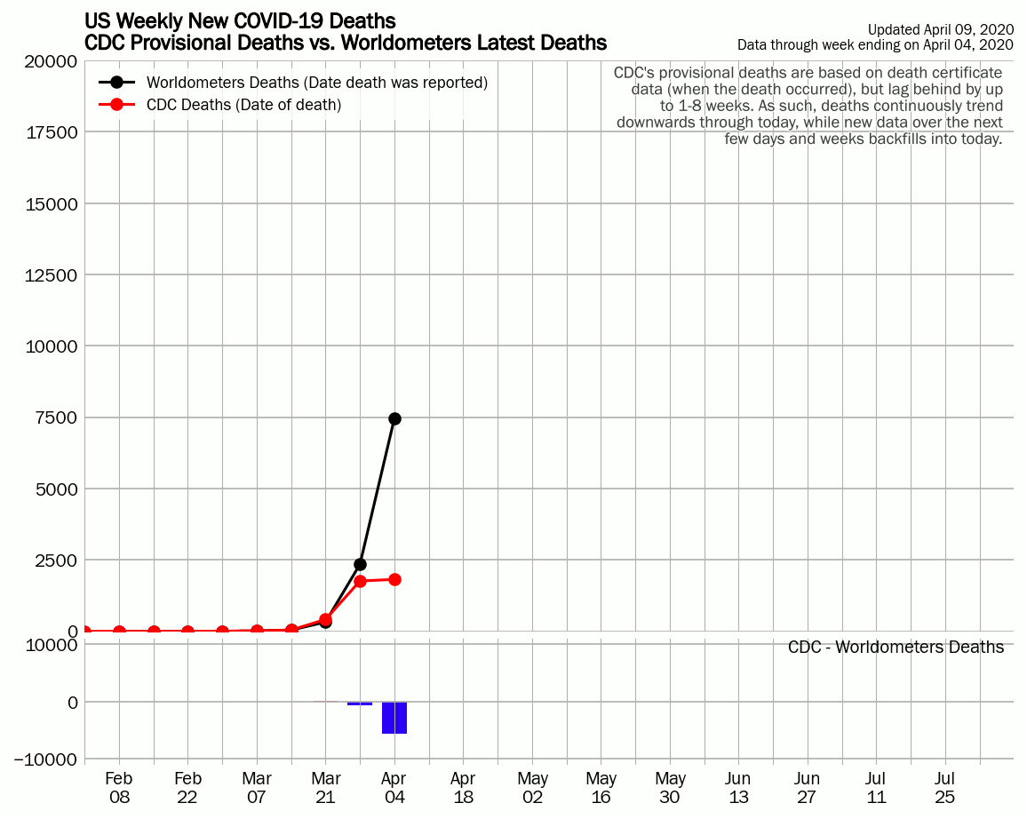 These claims were particularly widespread around April and May, citing CDC's Provisional Death Counts page (Source).
This page differs from other sources as it reports deaths by *date of death*, using death certificate data, which can lag by up to 1-8 weeks after the death occurred.
In contrast, realtime sources provide deaths by the *date they were reported*, including deaths today and over the last few days or weeks. This means that most deaths occurred
at least days, if not weeks before they were reported.
These claims were particularly widespread around April and May, citing CDC's Provisional Death Counts page (Source).
This page differs from other sources as it reports deaths by *date of death*, using death certificate data, which can lag by up to 1-8 weeks after the death occurred.
In contrast, realtime sources provide deaths by the *date they were reported*, including deaths today and over the last few days or weeks. This means that most deaths occurred
at least days, if not weeks before they were reported.
This caveat explains why CDC's provisional death counts always trend much lower right through today - data for today is incomplete, and this is clearly labeled on the website. The animation to the left shows how the CDC provisional death counts trend by day, compared to Worldometers reported weekly deaths, clearly illustrating the backfilling effect of lagged death certificates.
"The death rate is going down"
During June 2020, daily new cases rapidly increased in the U.S. while deaths continued to decrease. This led to a decrease in Case Fatality Rate (CFR), or the fraction of confirmed deaths to confirmed cases.
The CFR is dependent on many things, such as the age of those infected (having trended down in June) and treatment methods, to name a few. It is well known that deaths lag cases by as much as several weeks (Source), meaning that once cases start to rapidly increase, a similar rapid increase in deaths won't follow until a few weeks later.
A counter-argument to this occasionally used is that the initial peak in new cases in March-April was at the same time as the peak in new deaths. This is largely due to the initial severe lack of testing, as initial cases went undetected until a widespread outbreak was already present.
"It's just the flu or a common cold"
COVID-19 is the name of the disease caused by the novel (new) SARS-CoV-2 virus. This is a different virus than the influenza virus (Source).
The common cold is often caused by common human coronaviruses (Source). These are different than this coronavirus, which is caused by a novel coronavirus sharing similarities with SARS.
"The seasonal flu is worse"
The seasonal flu is caused by a variety of influenza viruses (Source). The CDC *estimates* that deaths due to seasonal flu are often in the tens of thousands, and in 2019-2020 was *estimated* between 24,000 to 62,000 (Source).
Unlike COVID-19 confirmed deaths, which are mostly reported when there is a laboratory confirmed diagnosis, these flu death figures provided by CDC are estimates, as not everyone is tested for the flu, and can be much higher than laboratory confirmed flu deaths (Source).
Using the CDC's past 10 years of seasonal flu *estimated* symptomatic cases and deaths (Source), the estimated Case Fatality Rate (CFR) is 0.1%. For the COVID-19 pandemic, using confirmed data, the CFR globally is 3.9%.
"The 2009 swine flu pandemic was worse"
The 2009 H1N1 pandemic is often cited to have caused either 12,469 or 18,306 deaths in the US. Besides the fact that this is substantially lower than confirmed COVID-19 deaths in the US through July 2020 (over 140,000), this figure is an *estimate* of H1N1 pandemic deaths from a CDC study (Source).
Confirmed H1N1 pandemic U.S. deaths at the time were about 2,710 deaths; this comes from adding 593 confirmed 2009 H1N1 deaths through August 2009 (Source), and 2117 confirmed deaths from Sept 2009 - May 2010 (Source). The latter combined H1N1 deaths with seasonal flu deaths.
Using CDC's median values for estimated infections and deaths from the H1N1 pandemic, an Infection Fatality Ratio (IFR) of about 0.02% is yielded. This is consistent with a study based in England (Source). The IFR is still uncertain for COVID-19 as the pandemic is still ongoing, but latest estimates are between 0.5-1%, with one non-peer reviewed study showing 0.68% (Source).
According to the earlier noted England study, prior studies estimating the Case Fatality Rate (CFR), using confirmed data as opposed to estimated data, found a CFR of 0.1% to 0.9% for the 2009-10 H1N1 pandemic. Confirmed case data for COVID-19 thus far shows a global CFR of 3.9%.
"CDC mysteriously revised deaths downward"
These claims were particularly widespread around April and May, citing CDC's Provisional Death Counts page (Source).
This page differs from other sources as it reports deaths by *date of death*, using death certificate data, which can lag by up to 1-8 weeks after the death occurred.
In contrast, realtime sources provide deaths by the *date they were reported*, including deaths today and over the last few days or weeks. This means that most deaths occurred
at least days, if not weeks before they were reported.
This caveat explains why CDC's provisional death counts always trend much lower right through today - data for today is incomplete, and this is clearly labeled on the website. The animation to the left shows how the CDC provisional death counts trend by day, compared to Worldometers reported weekly deaths, clearly illustrating the backfilling effect of lagged death certificates.
31 March 2021
A bug in displaying the interactive charts in some browsers has been fixed.
30 March 2021
Data from The COVID Tracking Project has now been replaced with data from CDC and HHS. This data does not update every day, especially for testing data which can lag by up to a week.
1 September 2020
1. Updated Texas deaths reallocated by date of death based on data from The COVID Tracking Project.
2. Updated United Kingdom deaths update from Johns Hopkins CSSE that removed several thousand deaths from the cumulative count.
16 August 2020
1. Most sources, including CDC, do not include additional U.S. data that Worldometers includes (e.g., federal prisons, U.S. Military, etc.), which results in Worldometers and thus this source showing a substantially higher case and death count than other sources. To avoid confusion, these data have been removed until additional sources include that data in their cumulative case and death tally.
2. New Jersey reallocated its probable deaths by date of death. While this method differs from the method reported here (date of death reported), these deaths have been reallocated in this source as well using data from The COVID Tracking Project.
3. There have occasionally been discrepancies between the U.S. cumulative data in the "US States" tab, and the US section in the "World" tab. These discrepancies have now been removed.
26 July 2020
The page underwent a redesign, with information at the top of the page split into subsections.
Additionally, interactive charts displaying case and death data are now available for all U.S. states, and numerous countries and U.S. counties.
23 July 2020
New summary plots were added for individual countries as well as the world total, showing cumulative and daily confirmed cases and deaths, as well as testing data based on Worldometers.
30 June 2020
The data used in this site was revised last night to account for discrepancies. Internationally, daily data in the UK & Chile were changed to Johns Hopkins CSSE as Worldometers daily data for those countries was biased too high. In the US, cumulative & daily data for NY, NJ, CA, IL, KS, PA, OH, TX, and WA was applied from Johns Hopkins CSSE, while daily new cases for NY were obtained via The COVID Tracking Project as its numbers are consistent with official NY state data, and lacks the daily discrepancies that Johns Hopkins CSSE has.
U.S. STATES
U.S. COUNTIES
WORLD
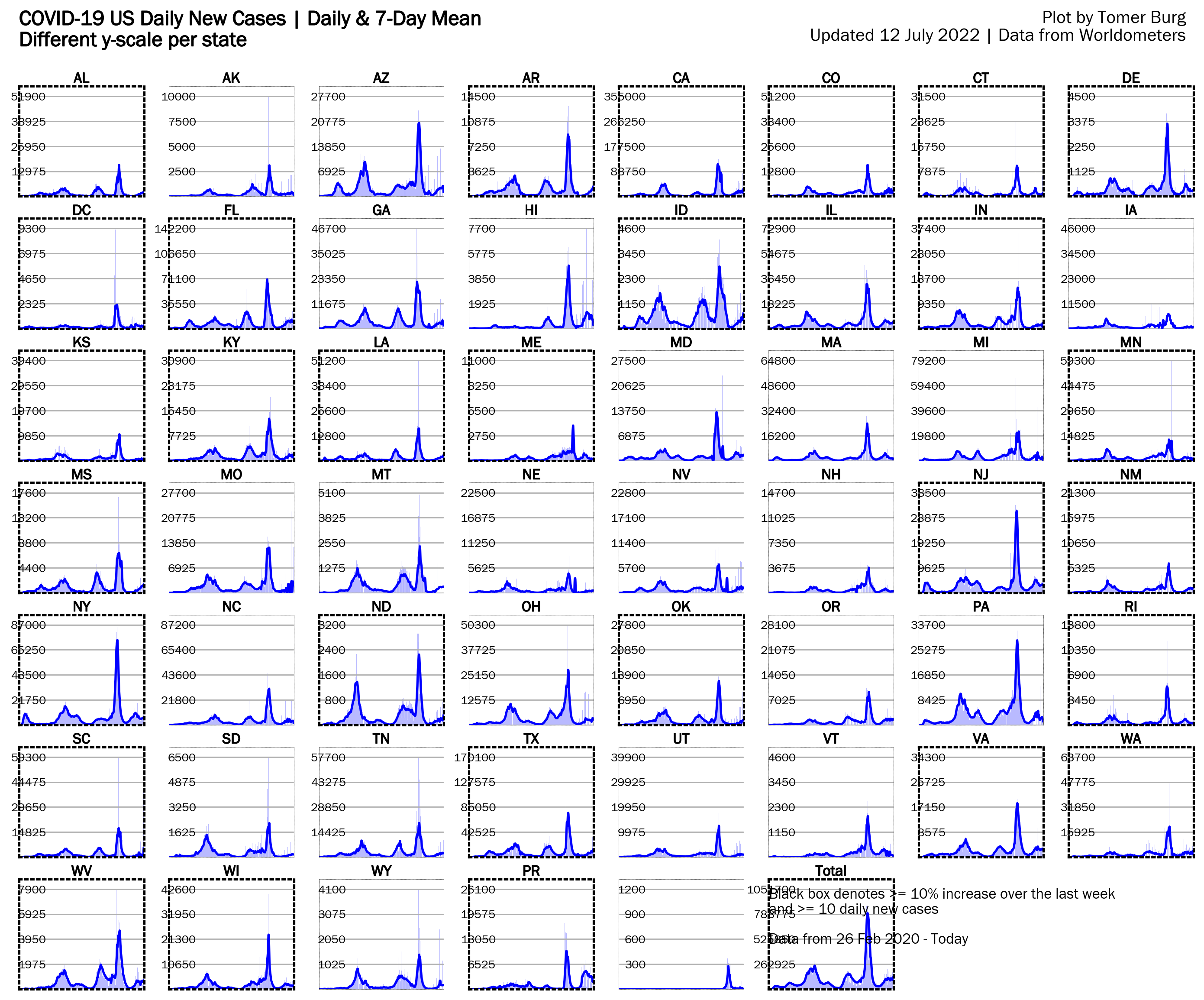
These plots show individual U.S. state data for daily new cases & deaths, tests and hospitalizations. Update frequency is once a day at about 8:20pm EST for cases & deaths, and 6:20pm EST for test and hospitalization data.
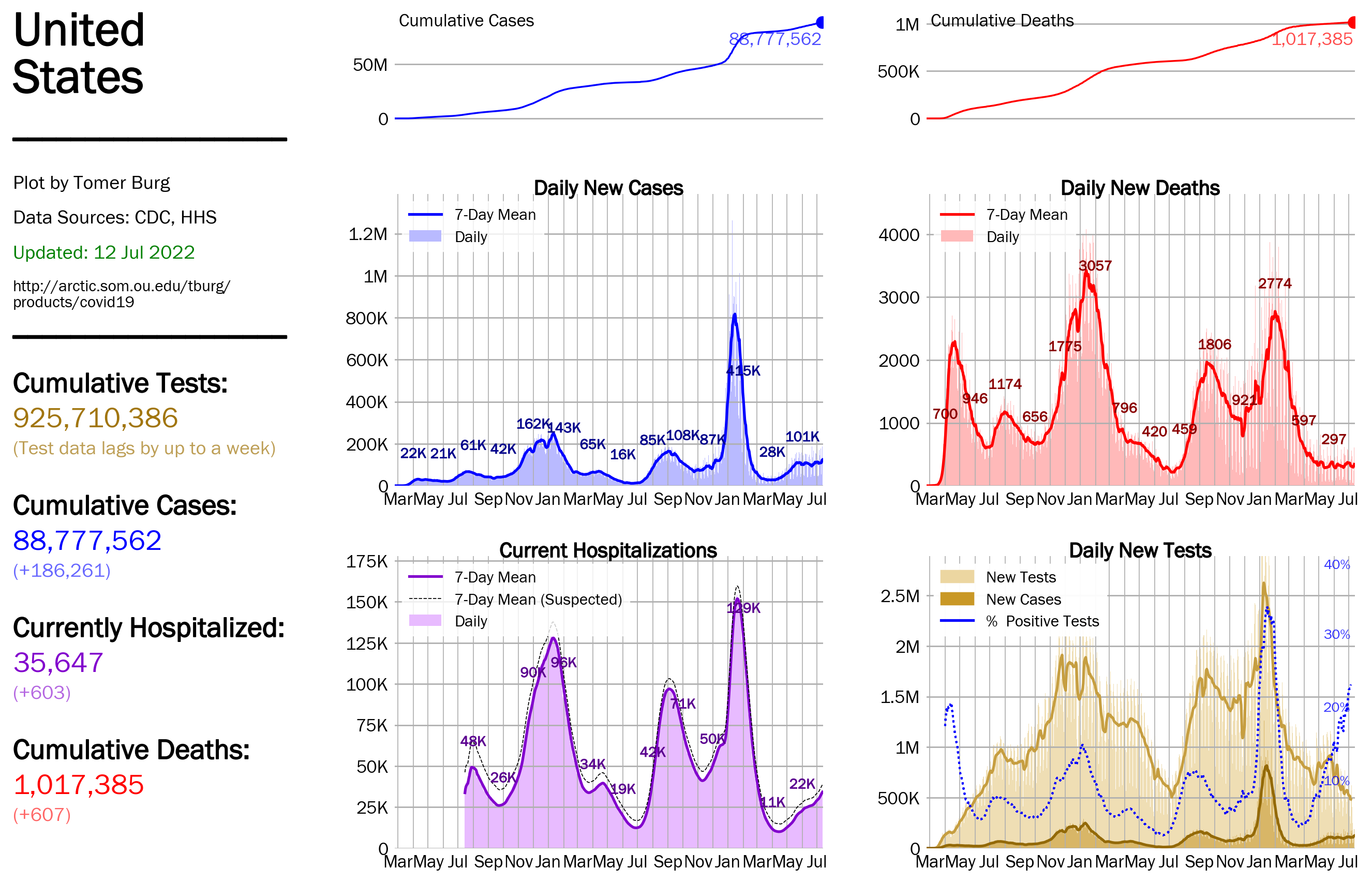
Summary plots exclusively use data from CDC and HHS, so the case and death data for those will differ from other plots on this website.
This section includes U.S. state summary plots for daily new cases & deaths, tests and hospitalizations. Update frequency is once a day at about 8:20pm EST for cases & deaths, and 6:20pm EST for test and hospitalization data.
Interactive charts for individual state data for daily new cases & deaths, courtesy of Worldometers. Update frequency is once a day at about 6:20pm EST.
These plots show continental U.S. state maps for various metrics. Update frequency is once a day, around 8:20 pm EST.
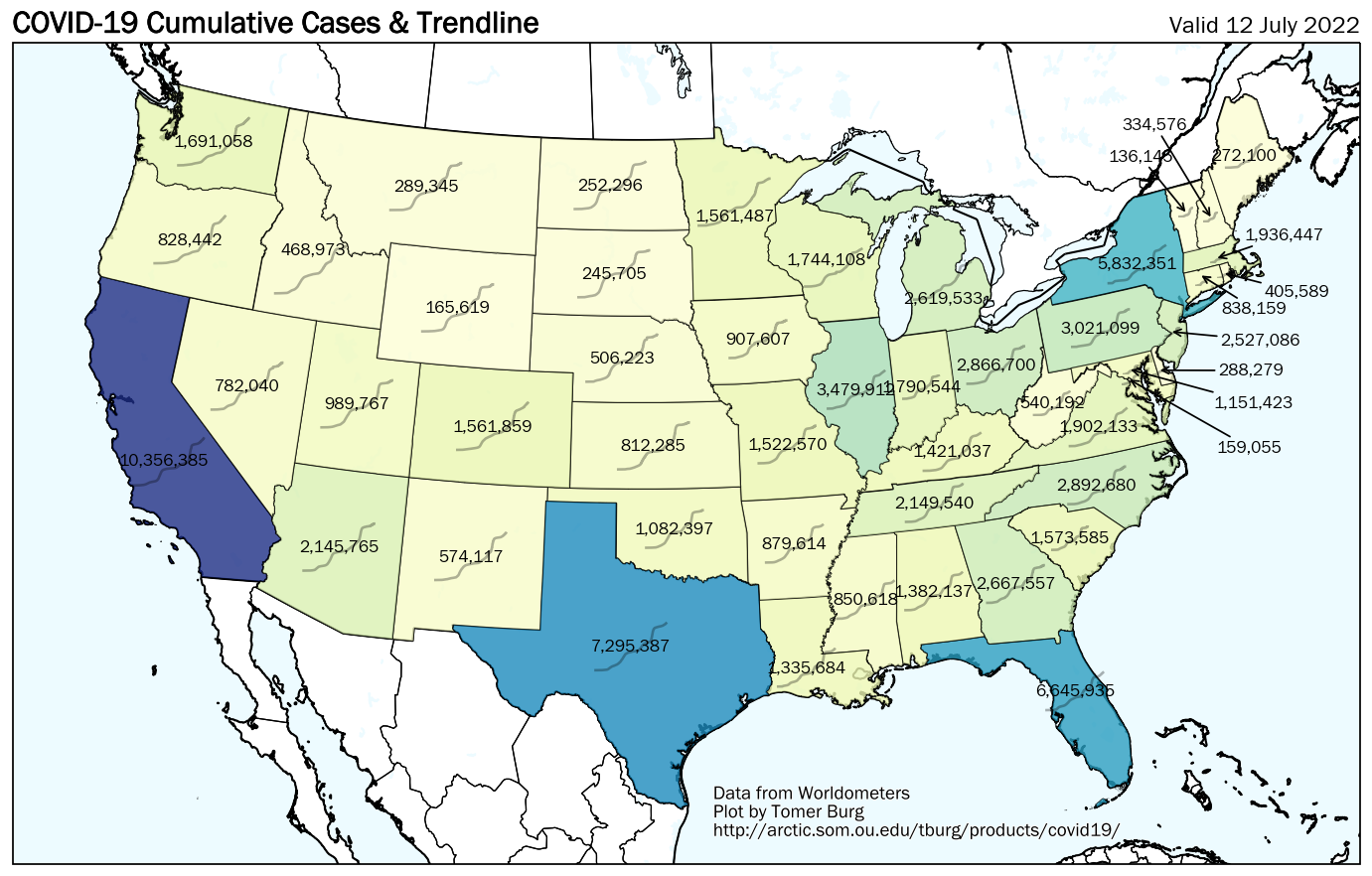
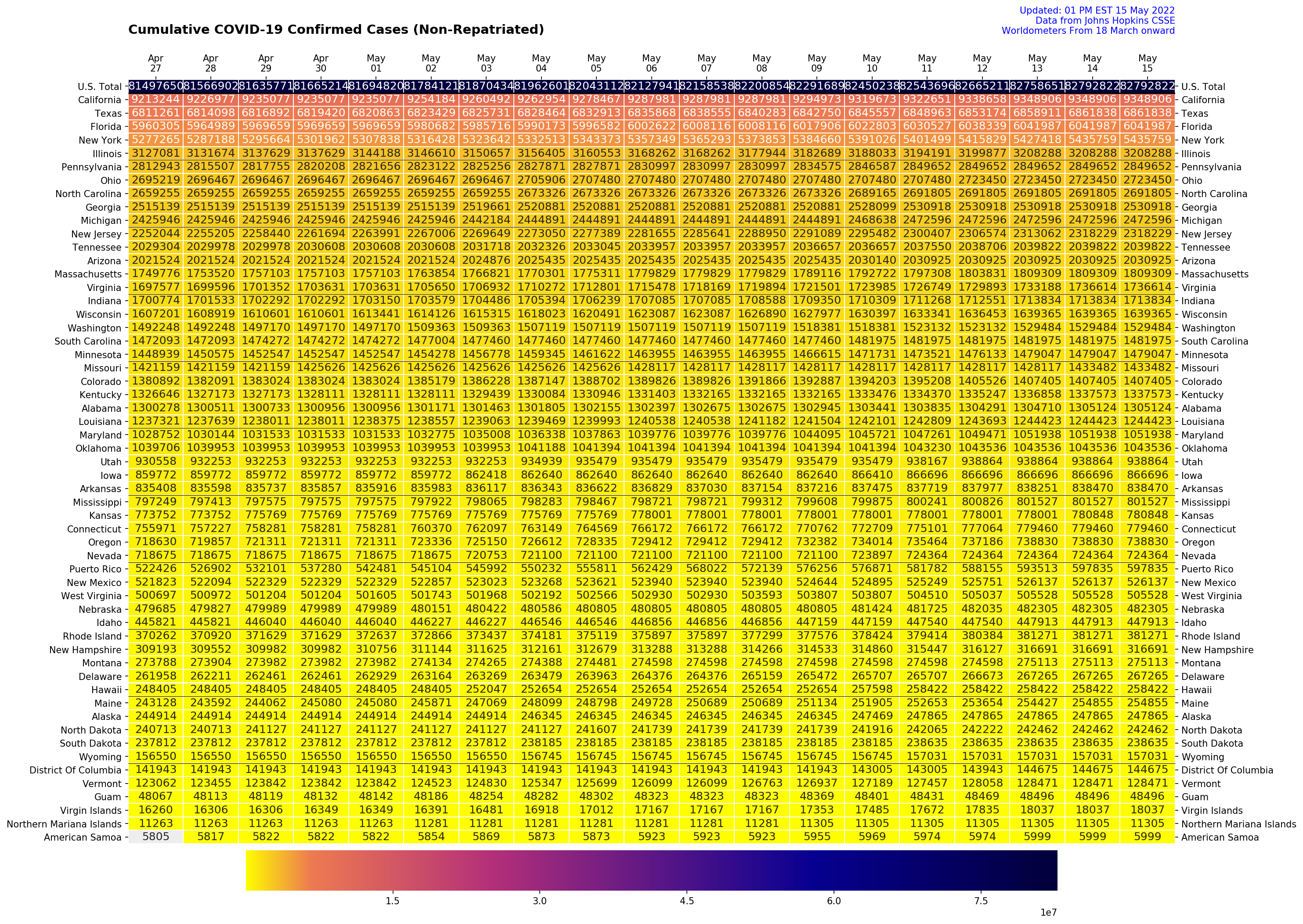
These plots are summary tables for U.S. states and Puerto Rico for cases & deaths. Update frequency is every 2 hours in the morning and every hour in the afternoon; final daily updates are posted around 8:10pm EST.
Interactive charts for the top states for daily new cases & deaths. Update frequency is once a day at about 8:20pm EST.
All U.S. county data is courtesy of Johns Hopkins.
US Counties Maps
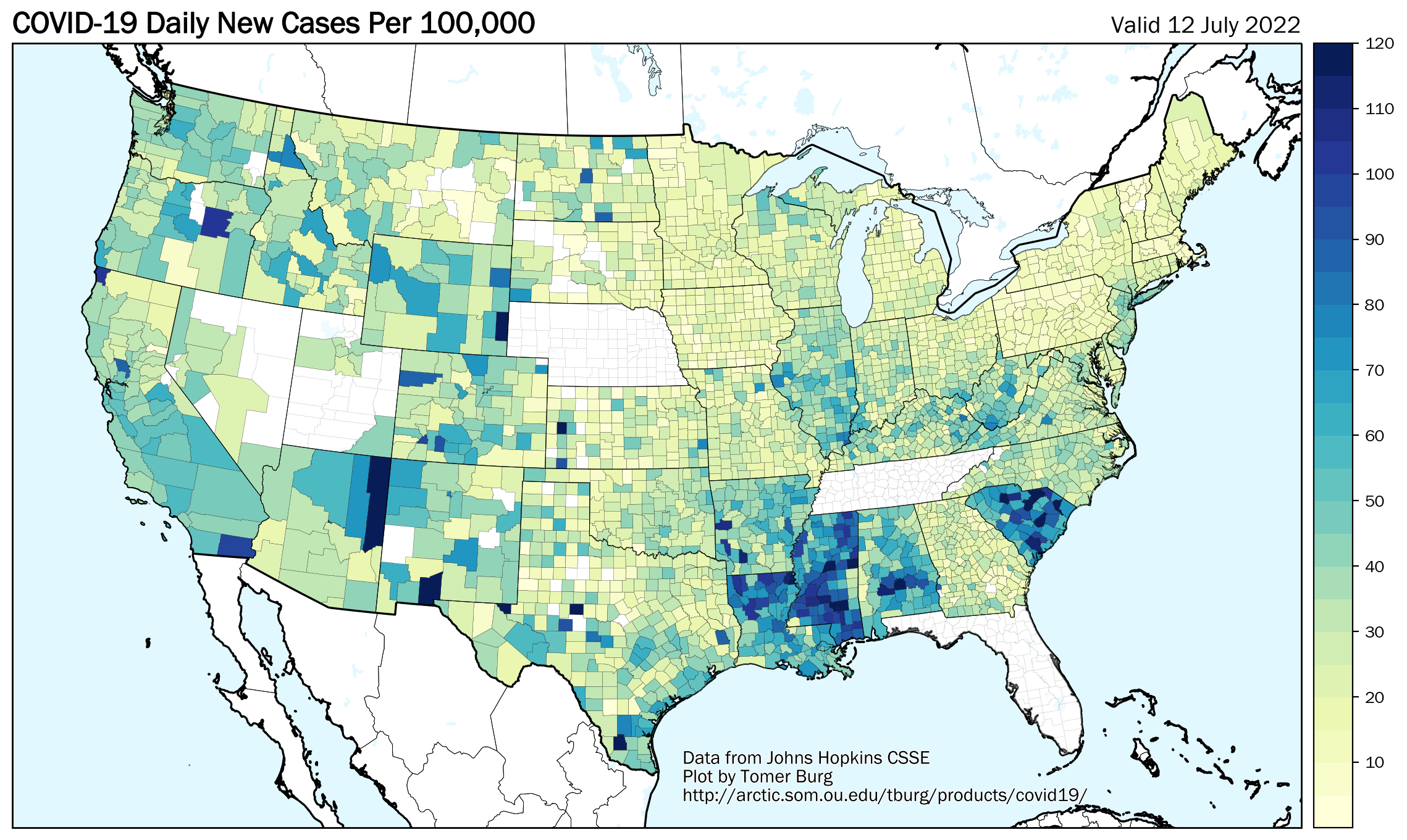
These plots show continental U.S. county maps for cases & deaths. Update frequency is once a day around 7:20am EST.
Interactive County Chart
Interactive charts for individual counties for cases & deaths. Only counties with >= 500 confirmed cases are included. Update frequency is once a day at about 7:20am EST.
US Counties Searchable Table
This section contains a searchable table by U.S. county. Update frequency is once a day around 7:20am EST.
These plots show continental U.S. county maps for cases & deaths. Update frequency is once a day around 7:20am EST.
Interactive charts for individual counties for cases & deaths. Only counties with >= 500 confirmed cases are included. Update frequency is once a day at about 7:20am EST.
This section contains a searchable table by U.S. county. Update frequency is once a day around 7:20am EST.
Sort by:
Search county:
Search county:
These plots show individual country data for daily new cases & deaths, for countries that recorded >= 50 daily new cases at any point. Update frequency is once a day at about 8:20pm EST.
Vaccination data is available for select countries, courtesy of Our World In Data.
Interactive charts for individual country data for daily new cases & deaths, for countries that recorded >= 50 daily new cases at any point. Update frequency is once a day at about 8:20pm EST.
Interactive charts for top 20 countries with population over 500K for daily new cases & deaths. Update frequency is once a day at about 8:20pm EST.